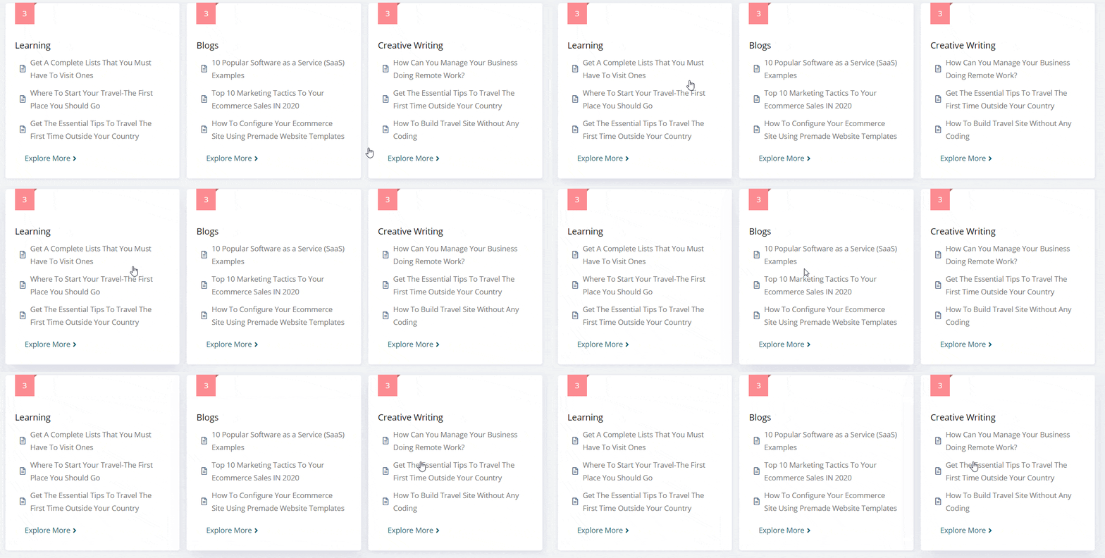
BetterDocs Category Grid lets you add the Grid layout of BetterDocs landing page documentation in your Elementor pages. You can easily customize it and style the layout as per your preference inside Elementor. It can come in very handy to display your knowledge base on any page you want. Check out this guideline below to see how to configure & style BetterDocs Category Grid:
How to Activate BetterDocs Category Grid #
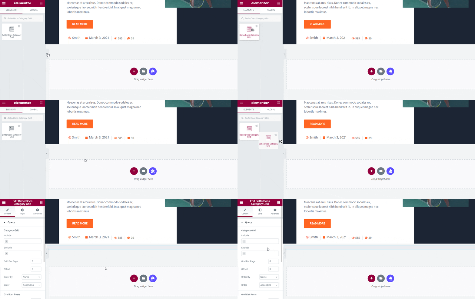
To use this element, find the ‘BetterDocs Category Grid ‘ element from the Search option under the ‘ELEMENTS‘ tab. Simply just Drag & Drop the ‘BetterDocs Category Grid’ into the ‘Drag widget here‘ or the ‘+’ section.
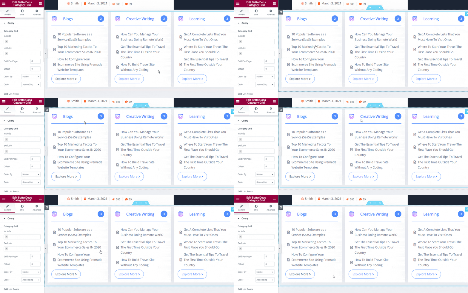
After you are successfully done with step 1, this is how the element is going to look like.
How To Configure the Content Settings #
You will get two featured sections in BetterDocs Category Grid ‘Content’ settings, ’Query’ and ‘Layout Options’. You can configure both to organize your online documentation following some steps on the website.
Query Settings #
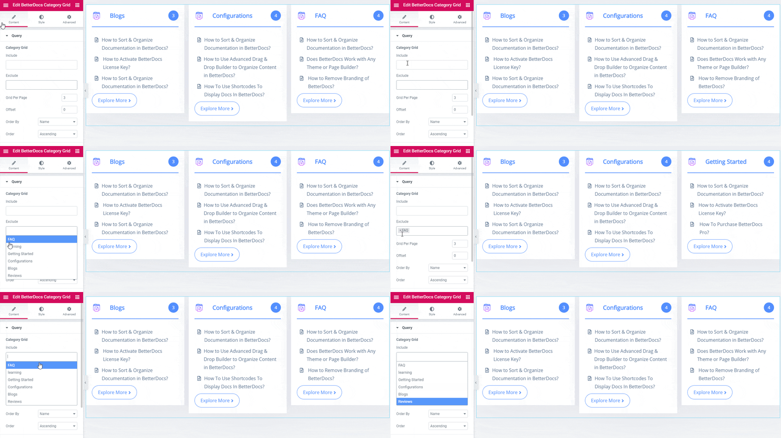
After getting all your documents in the grid layout, you can pick and display your desired document categories on the website through ‘Include’ or ‘Exclude’ features.
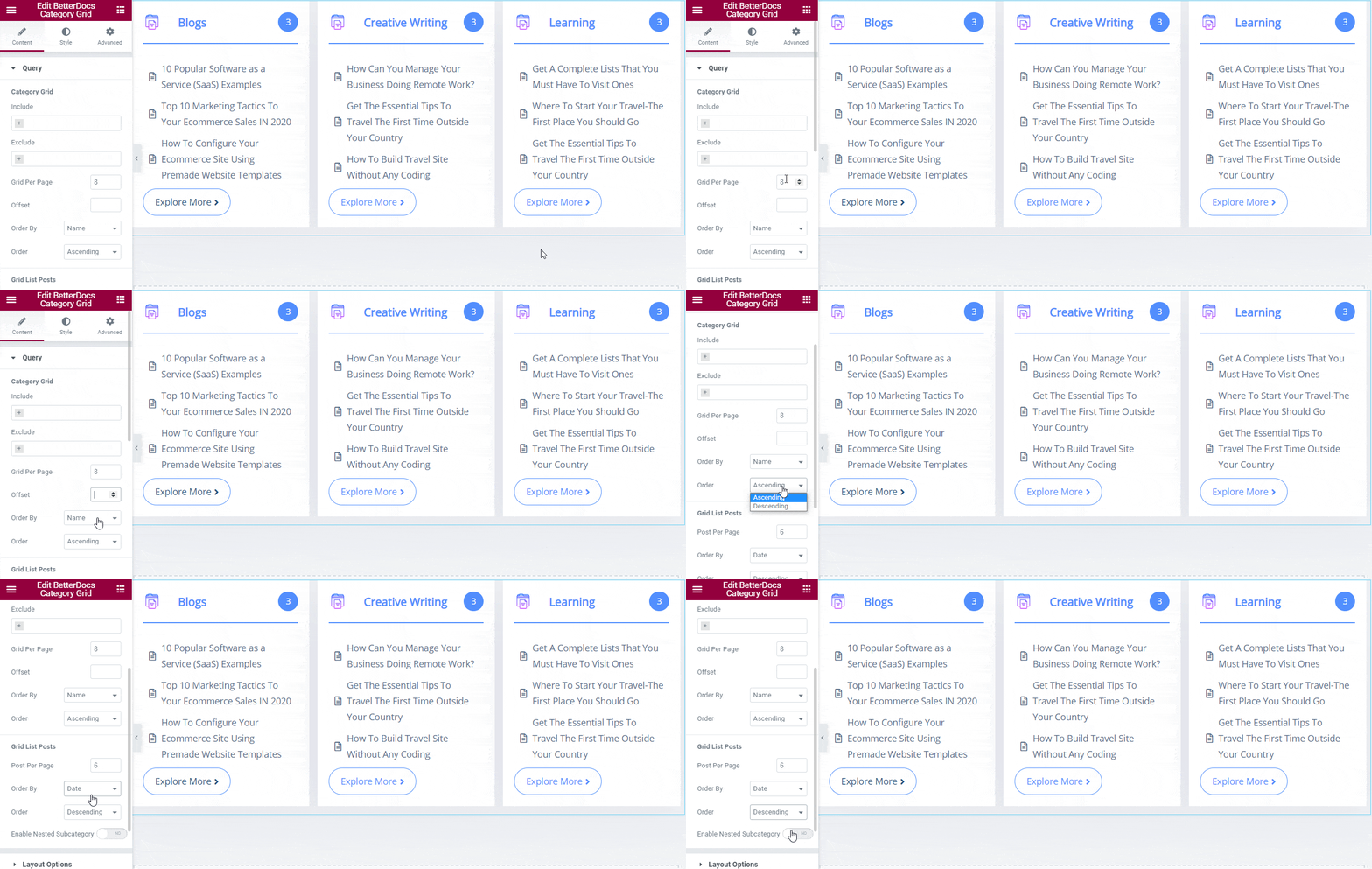
Besides, you can organize your document by ‘Grid Per Page’, ‘Offset’, ‘Order By’ them with the name, slug, id, etc, and ‘Order’ with ascending or descending. Moreover, you can change the posts per page, order by and others from ‘Grid List Posts’ section.
Layout Options #
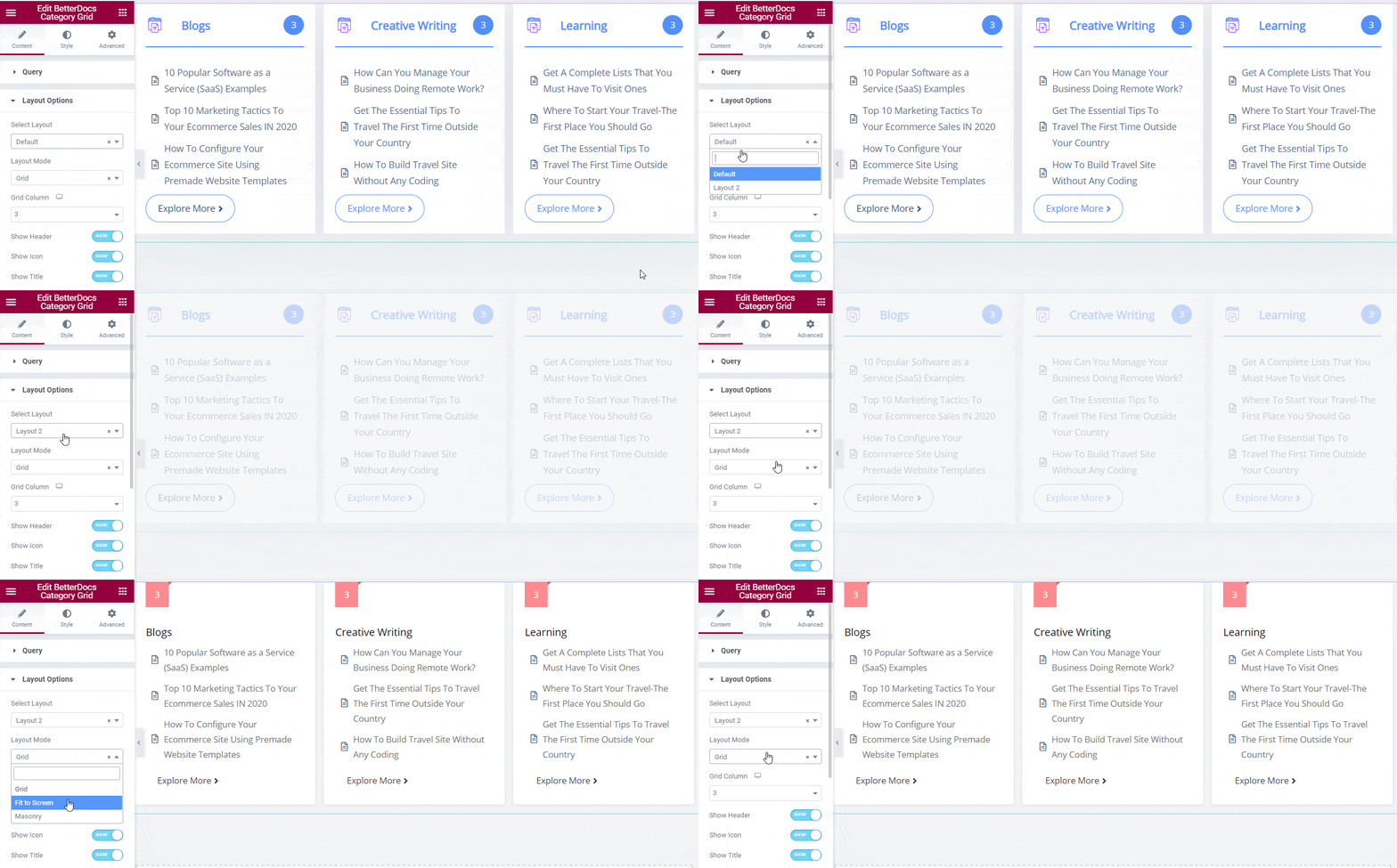
Once you have done with the Query settings, you can configure the ‘Layout Options’ settings next to pick the ‘Default‘ or ‘Layout 2’ design and accordingly change the ‘Layout Mode’ to Grid, Fit to Screen, or Mansory.
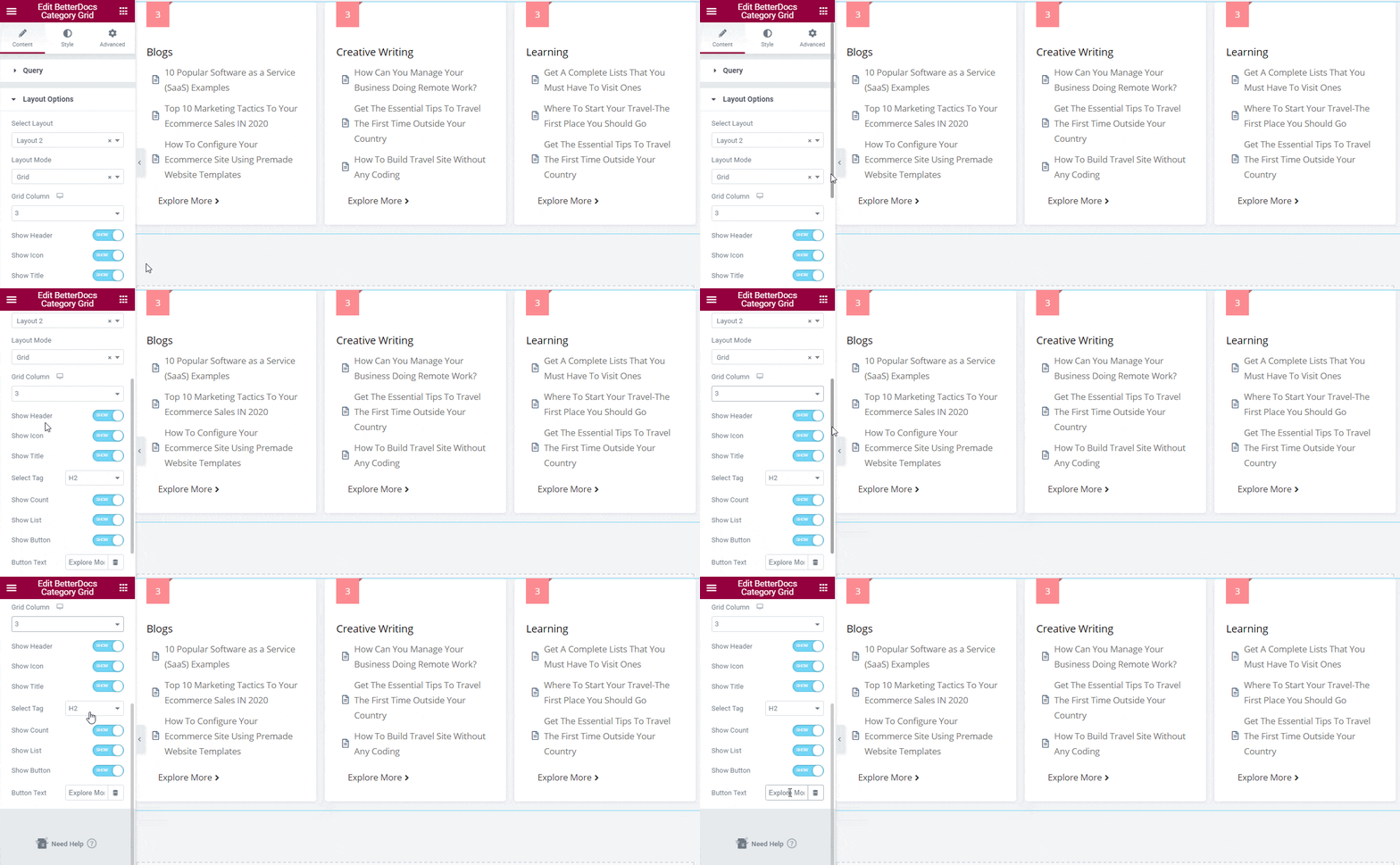
Besides, you can choose how many ‘Grid Column’ you want to create that would showcase your document in the grid layout. Afterward, you can enable the header, icon, title, select the preferred title tag, show count, list, or button to make it well-organized and manageable for both ends. Moreover, you can change the content for ‘Button Text’ as well.
How To Style BetterDocs Category Grid #
From the ‘Style’ tab, you can style the BetterDocs Category Grid anyway you want and get your expected outcome.
Grid #
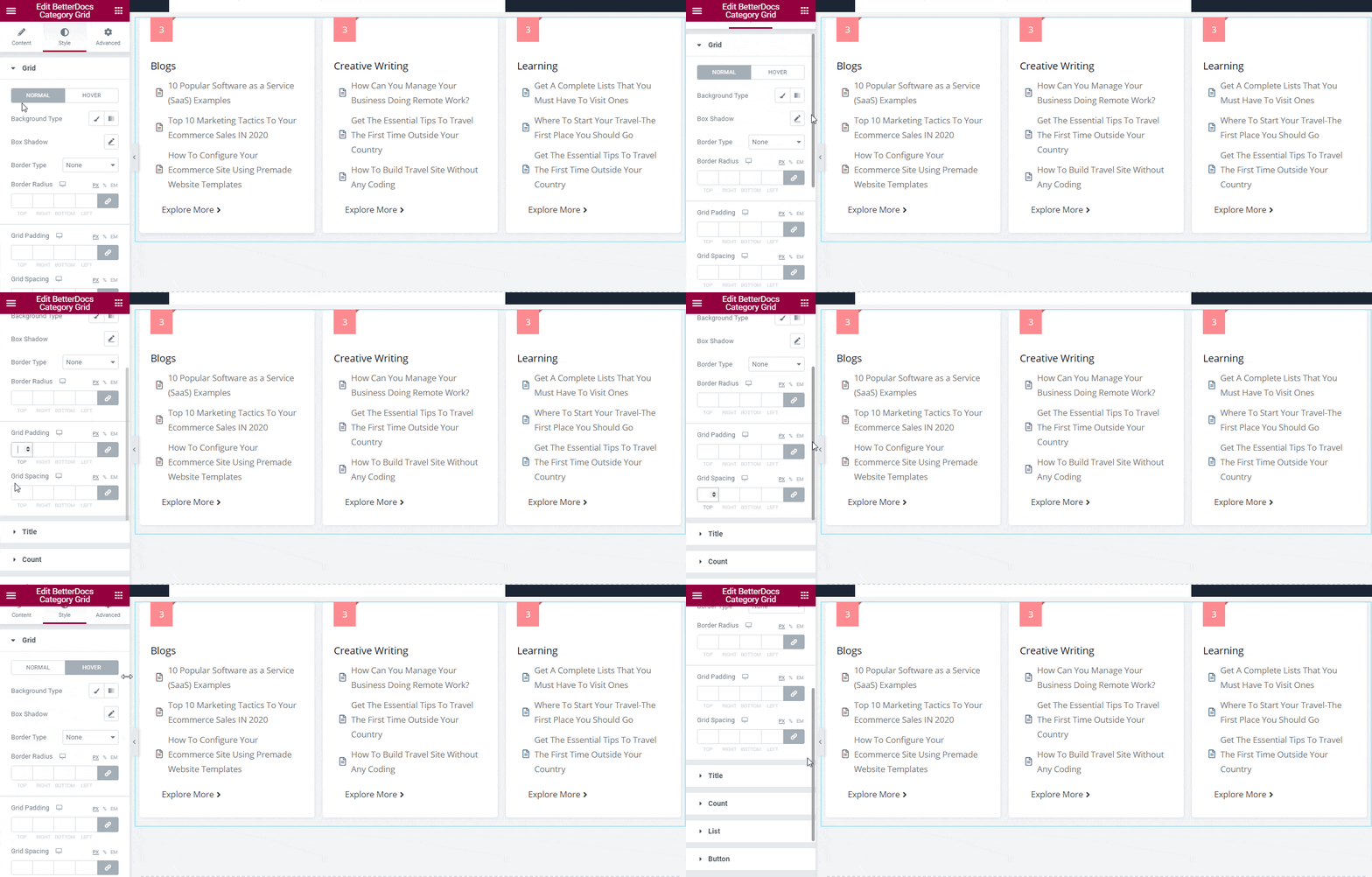
The ‘Grid’ layout style allows you to add background to the BetterDocs Category Grid layout. If you want, you can add a background image or change its color as you wish. Besides, you can add borders, change the border-radius, grid padding, and spacing of the category grid layout as well.
Others #
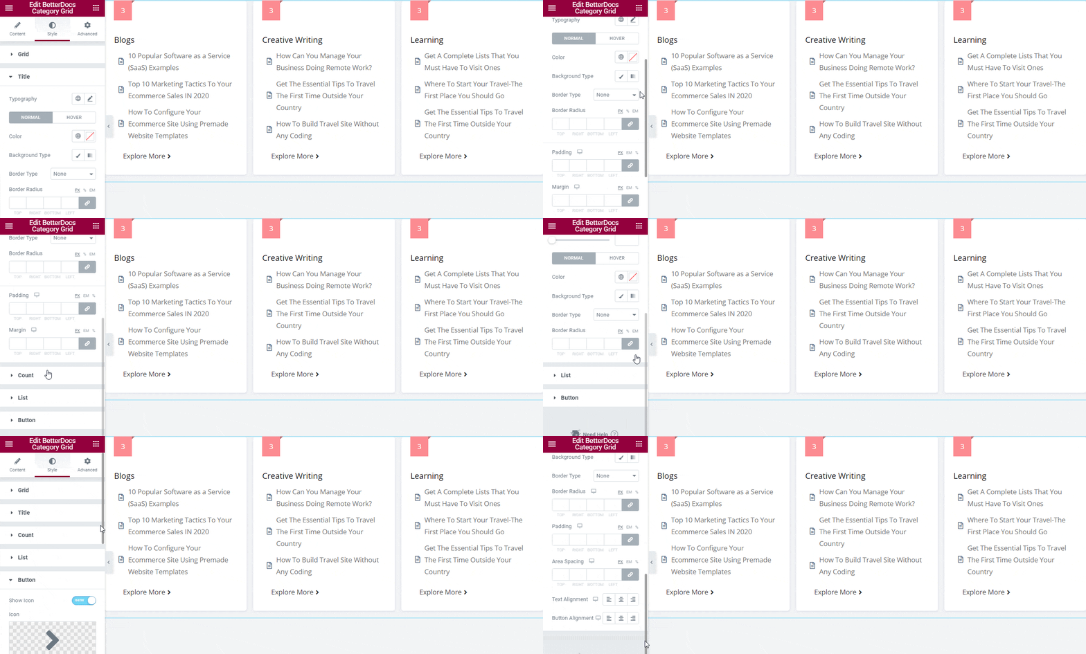
There are several customization options presented in the ‘Style’ tab. You can customize the ‘Title’ style by changing the typography and appearance of ‘Normal’, ‘Hover’ or both title styles color, background type, and more to make each document title interactive for readers.
You can change the outlook of your grid layout total document number that appears on the top by using the ‘Count’ style. Besides, you can configure ‘List’ and Button both styles to give your document category grid a unique look.
Final Outcome #
By following the basic steps and a bit more modifying, you can style your BetterDocs Category Grid as per your preference in Elementor.
By using BetterDocs Category Grid, this is how you can design an amazing knowledge base on your website and reduce the pressure on your support channel.
Getting stuck? Feel free to contact our amazing Support Team for any assistance.

