BetterDocs gives you seamless integration with Elementor. You can now design your Single Doc in Elementor without any coding by using the Elementor Theme Builder. Once you design a template for your Single Doc page, you can save it and then reuse it again for each of your single documentation pages.
Note: The Elementor Theme Builder is a feature that is only available with Elementor Pro. So, in order to configure Single Doc in Elementor, you must have the Pro version of Elementor installed and activated.
Follow these step-by-step instructions to find out how you can use BetterDocs to design your Single Doc in Elementor.
Step 1: Create a New Single Doc in Elementor Theme Builder #
Navigate to WordPress Dashboard → Templates → Theme Builder from your WordPress dashboard. Click on the ‘Add New’ button and select ‘Single Doc’ as your template type. Choose any template and click on the ‘Insert’ button. Your new template will now open in the Elementor editor.
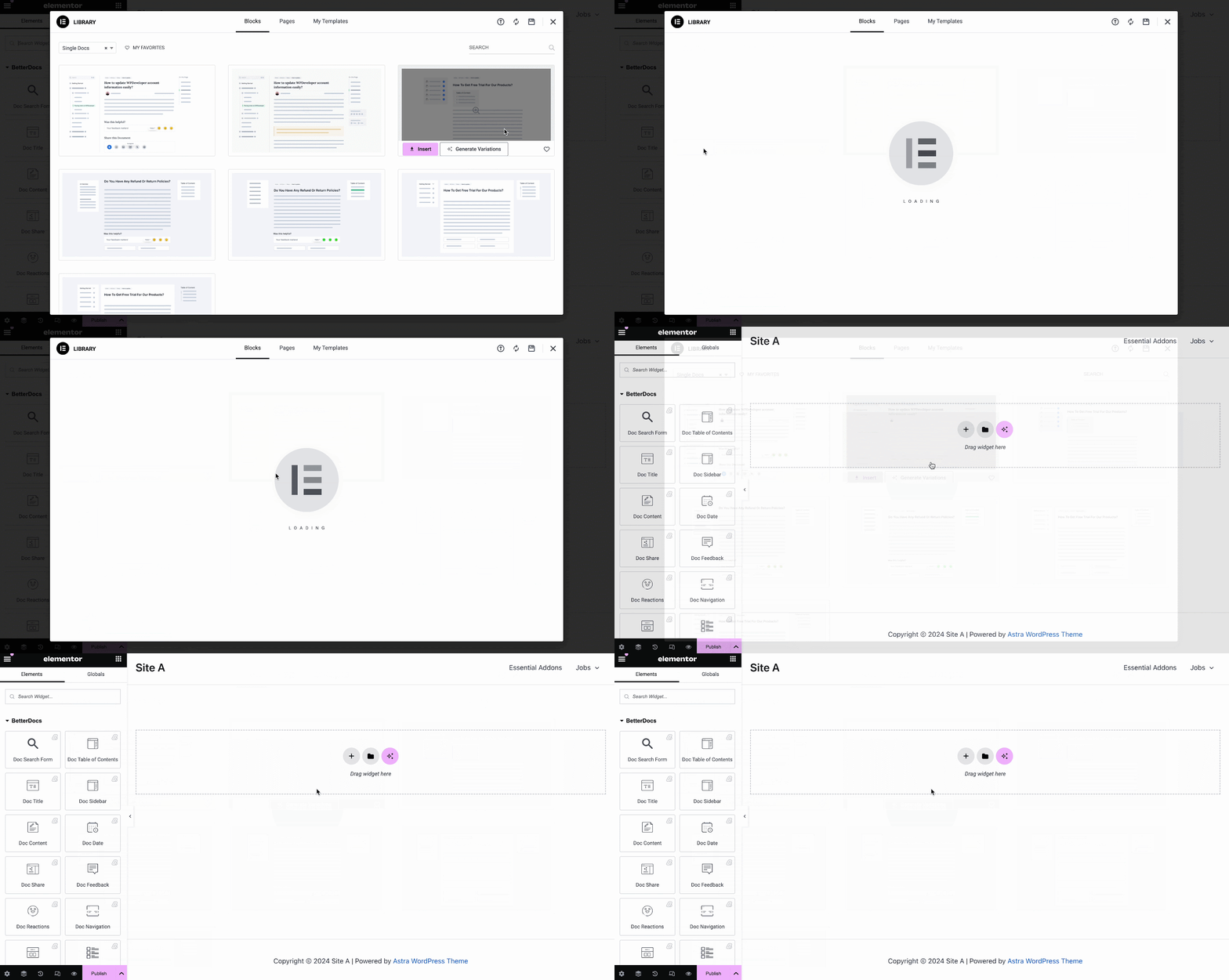
You can use BetterDocs premade-ready widgets to instantly create your single doc page. Or you can customize your single doc page from scratch by configuring different elements as shown in the next step.
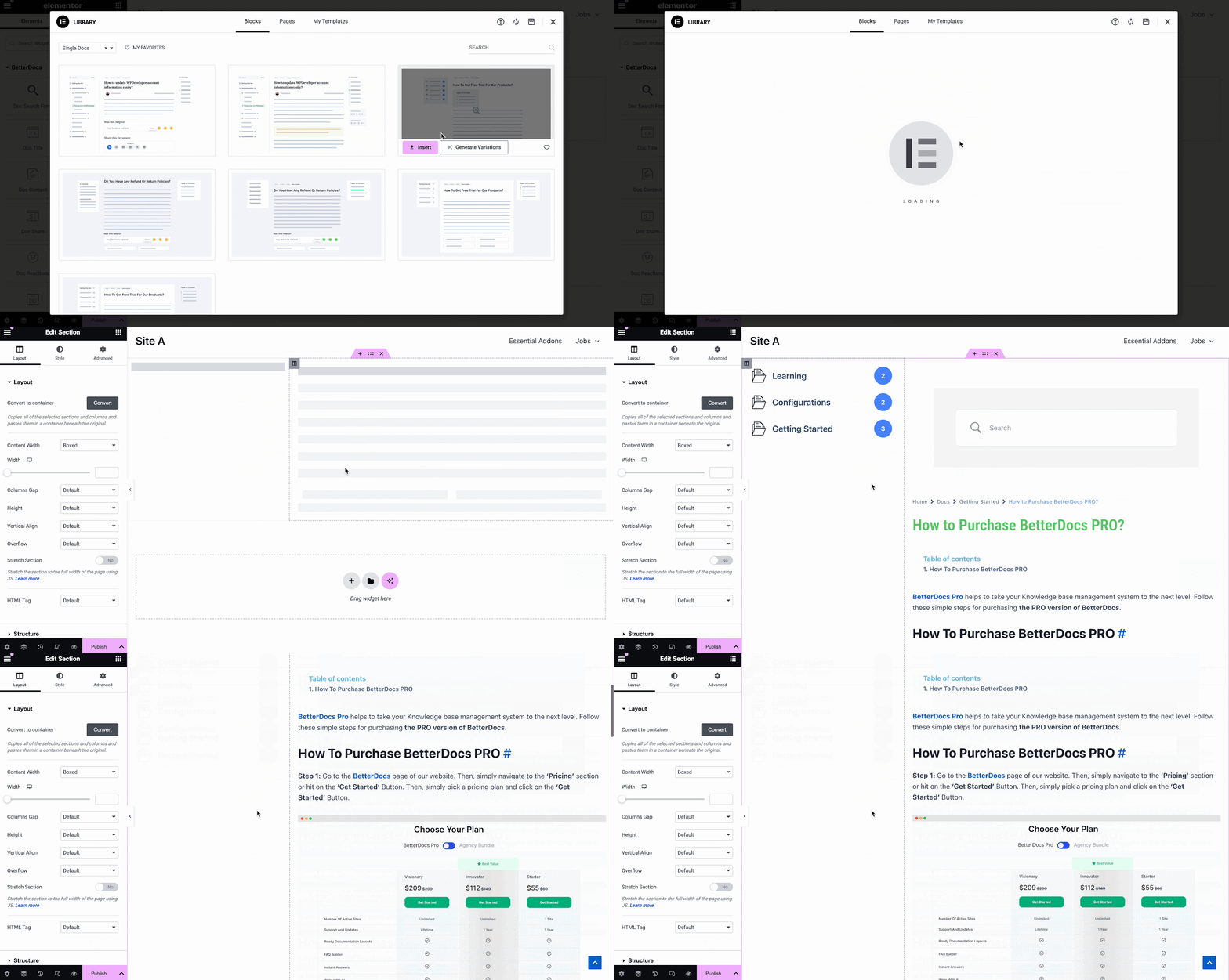
Step 2: Customize Single Doc in Elementor #
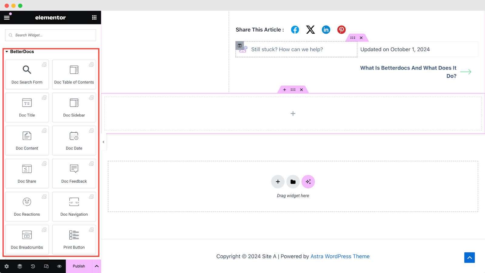
From the ‘ELEMENTS’ tab in Elementor Editor, you should see 12 BetterDocs elements to design your Single Doc page template. You can drag and drop these elements anywhere on your page to use them.
Doc Search Form #
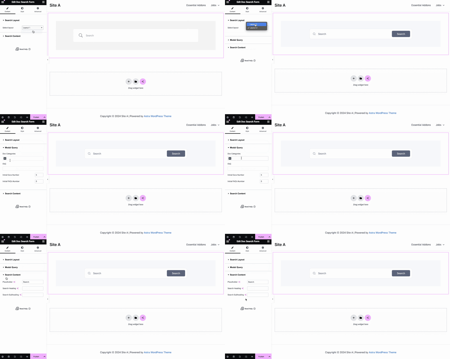
The Doc Search Form element lets you add a live search bar to your Single Doc page. To use this element, simply drag and drop it into any section of your page. Then, the element will appear on your page by default as shown below.
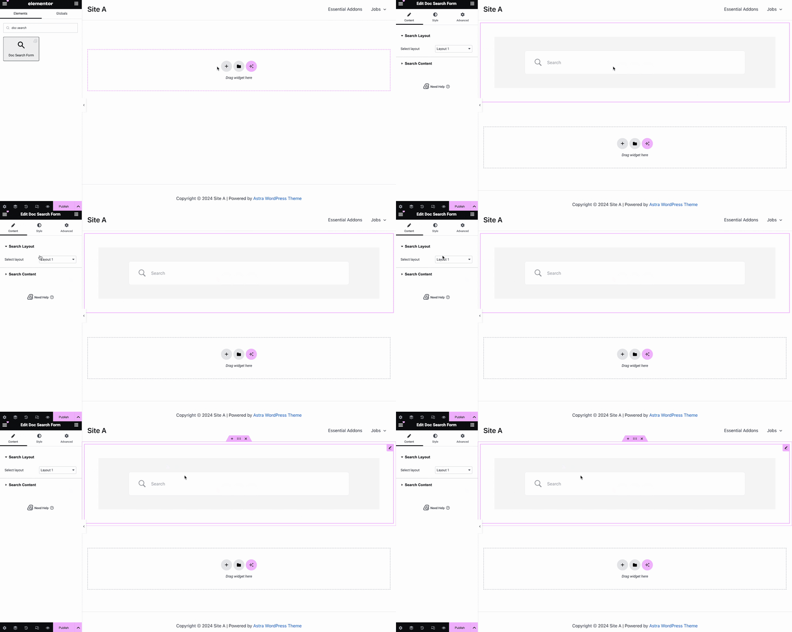
From the ‘Content’ tab, you can choose one from two templates and customize your Doc Search Form. If you choose Layout 2, you will have another option to configure Modal Query, where you can set doc categories, FAQ, doc numbers, etc.
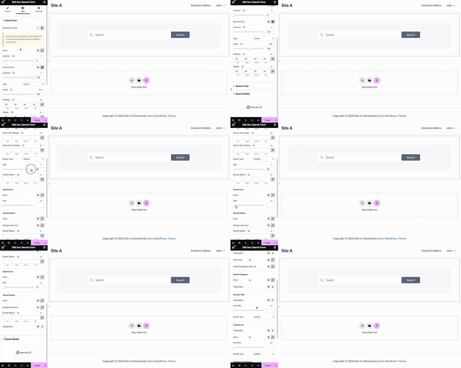
Under the ‘Style’ tab, you will see options for changing the background type and color of the ‘Search Box’ items. You can use images, solid colors, or gradient colors for your background.
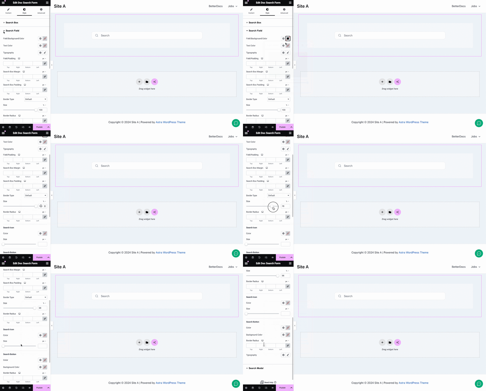
Similarly, under the ‘Search Field’ section, you have the option to change the field background color, field color, typography, padding, icons and much more. Plus, on the ‘Search Modal’ tab, you will have customization options for the search field, search category, content tab, content list, and more.
Doc Title #
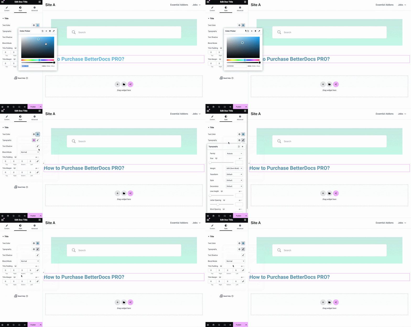
The Doc Title element dynamically adds the title of your Single Doc in Elementor. From the ‘Content’ tab, you can customize the title, link, html tag, and alignment.
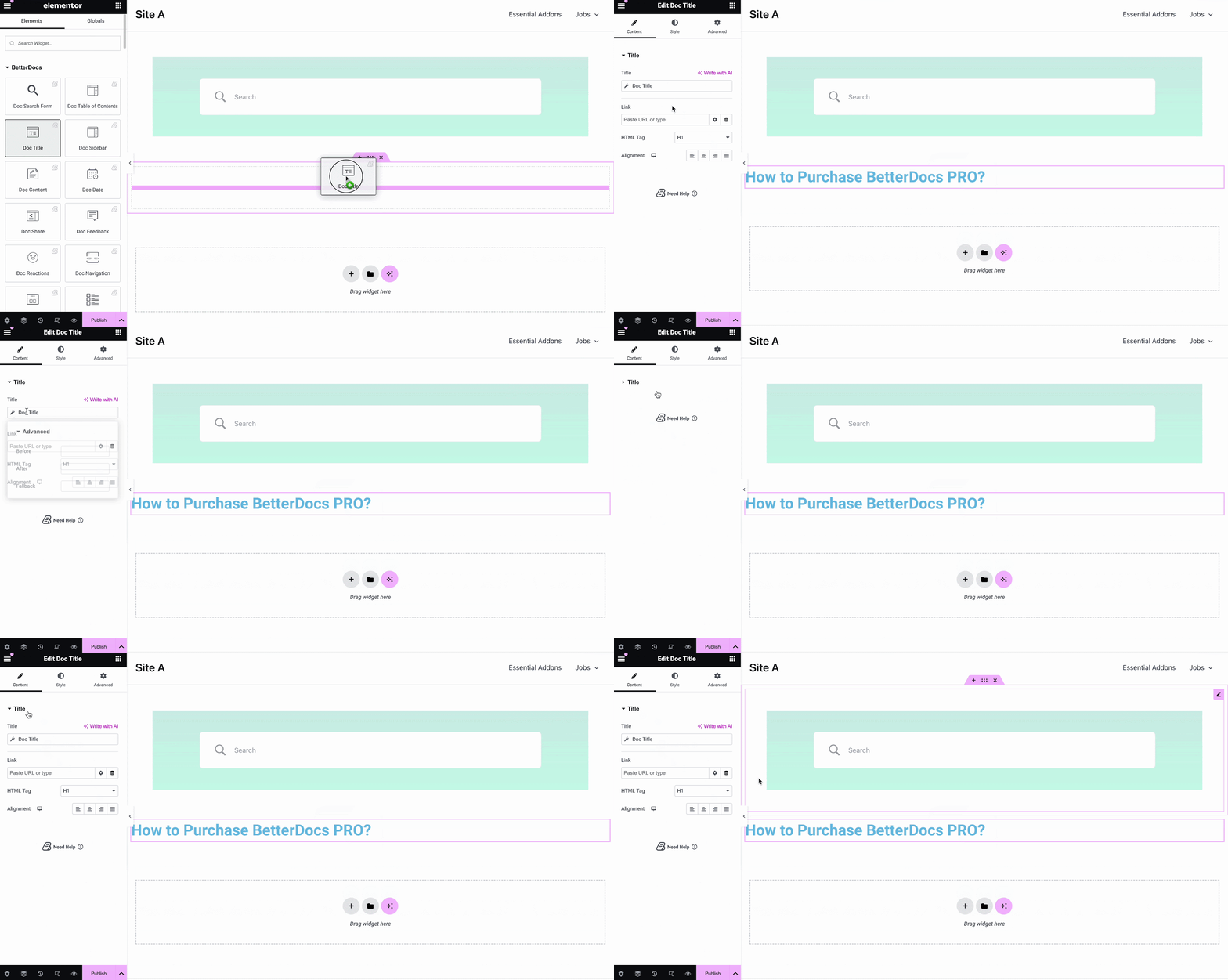
From the ‘Style’ tab you can change the title color, typography, blend mode and even add text-shadow.
Doc Table of Contents #
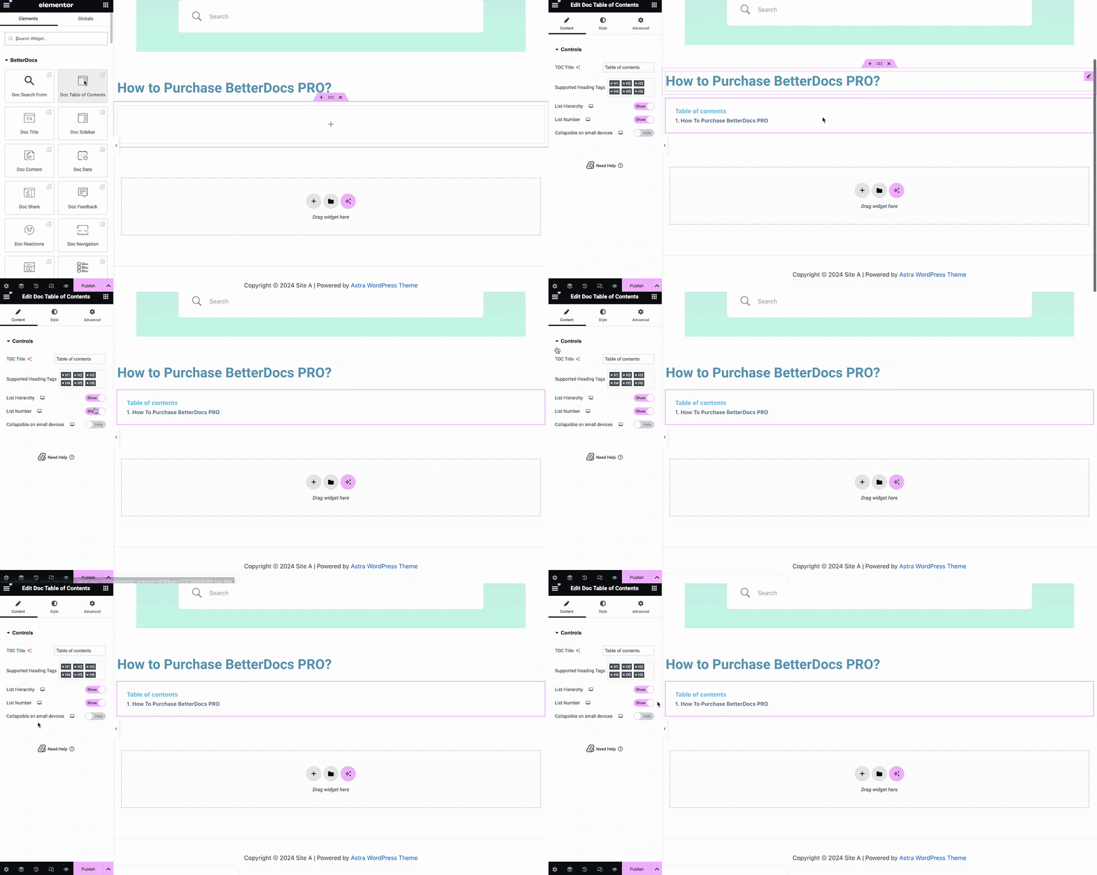
With the ‘Doc Table of Contents’ widget, you can customize the title, heading tags, hierarchy, list number and more on the Content tab, as shown below.
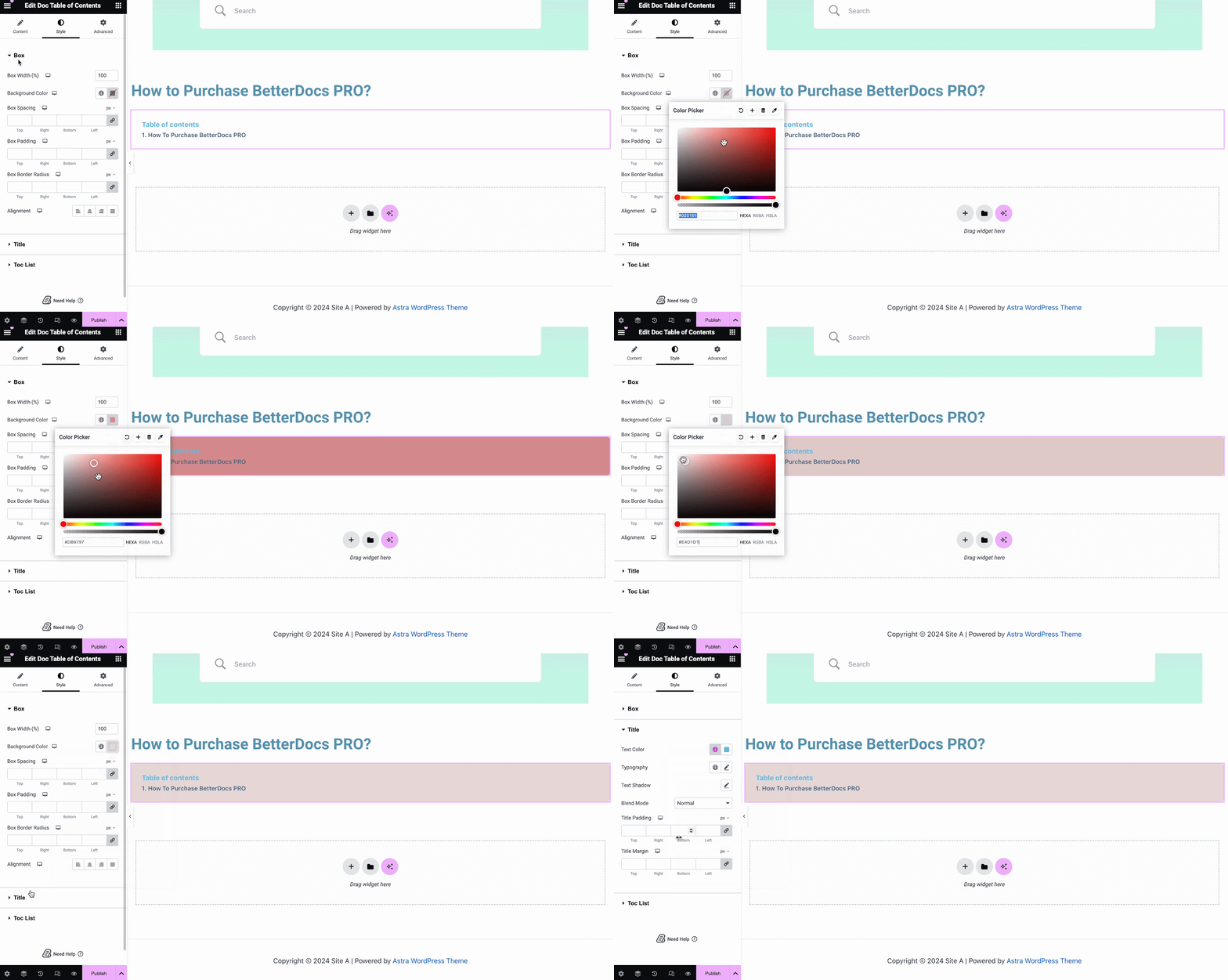
On the ‘Style’ tab, you can customize contents of the Box, Title, Toc list with the color, margin, padding, typography options.
Doc Content #
You can drag and drop the Doc Content element anywhere in your Single Doc page. The content of your documentation will be automatically added. You can then change the alignment, text color and typography from under the ‘Style’ tab as shown below.
Doc Date #
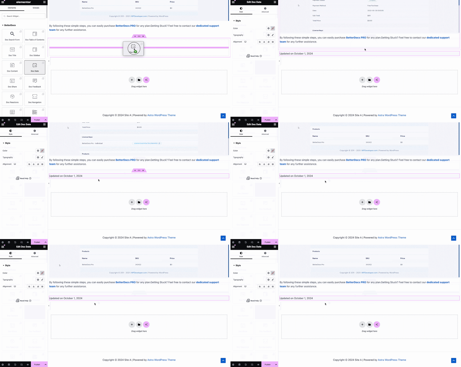
The Doc Date element lets you automatically display the date when your documentation has been updated. You can change the color, alignment and typography of the date from under the ‘Style’ tab.
Doc Sidebar #
The Doc Sidebar element lets you create a sidebar for your Single Doc in Elementor which displays all the other documentation articles and categories that you have created.
From the ‘Content’ tab, you can choose the layout for your Doc Sidebar. Currently there are five layouts available, each with its own distinct style.
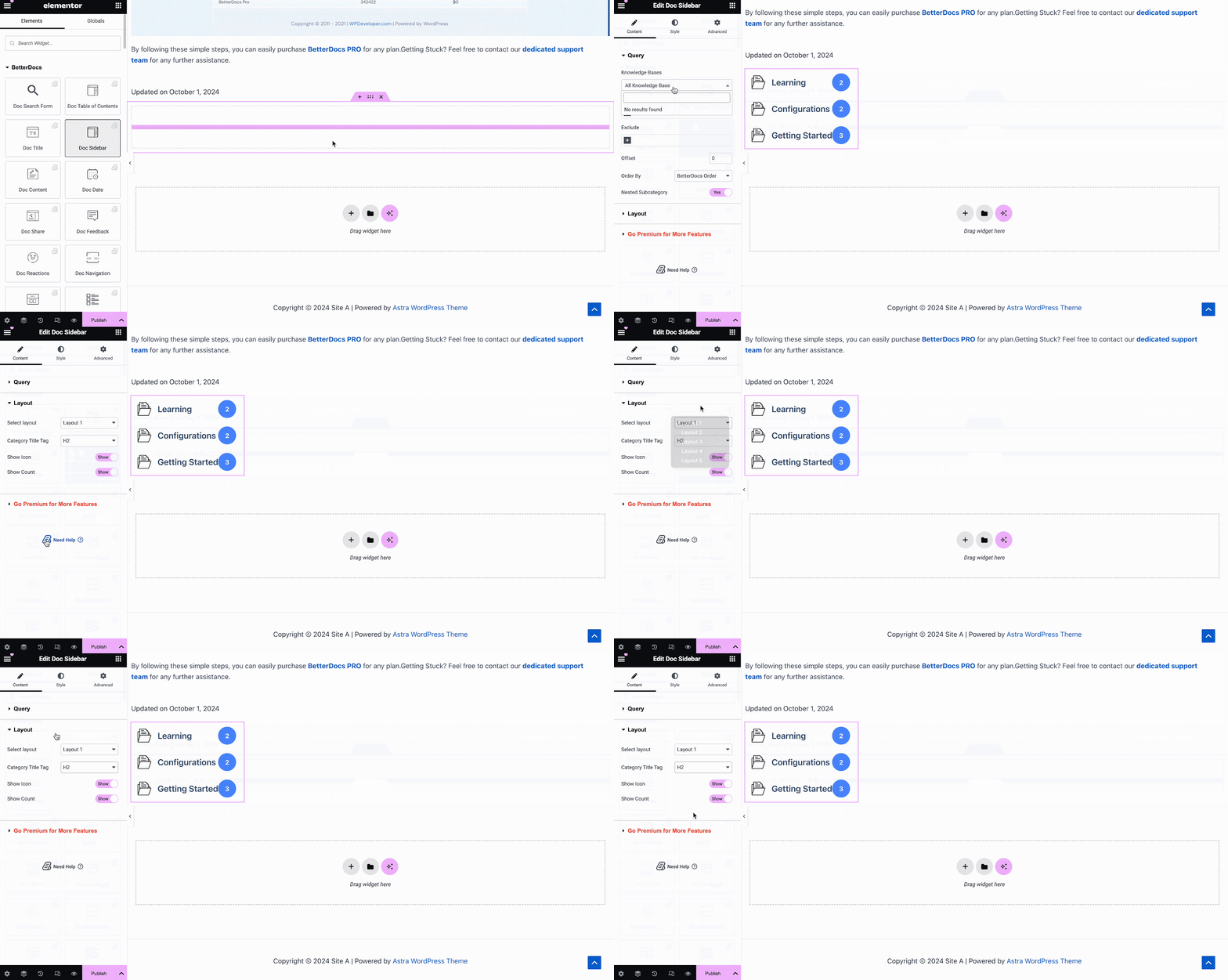
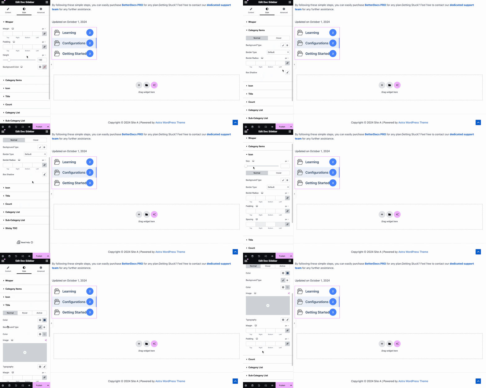
Under the ‘Style’ tab, you will see several options, including Wrapper, Icon, Category Style, Title, Count, Category List, etc. with the options to customize margin, padding, color, typography and more for a more personalized look.
Doc Reactions #
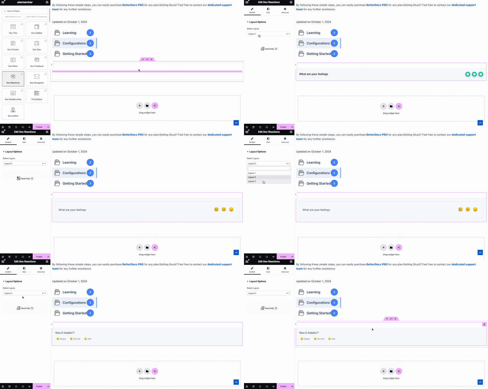
With BetterDocs Pro, you can find out how useful your documentation is to site visitors with the Doc Reactions element. There are three layouts to choose from on the Content tab.
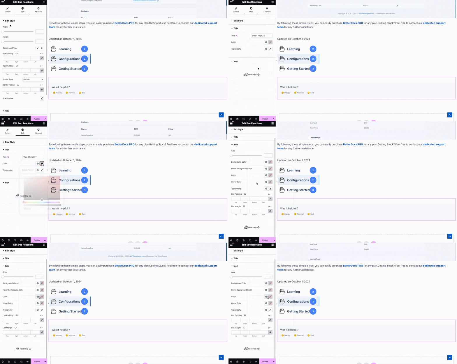
Under the ‘Style’ tab, there are several options to adjust color, margin, padding, typography and more for Box Style, Title and Icon.
Doc Share #
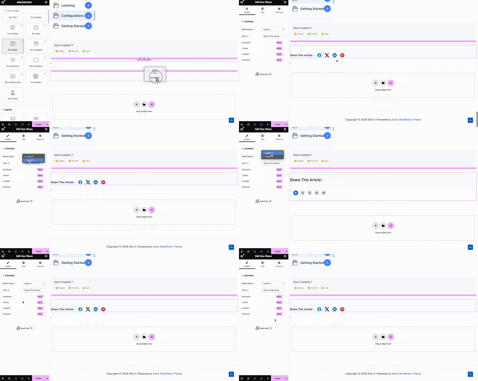
Doc Share element lets you enable social sharing for your documentation. With this element, site visitors can share your documentation on different social media platforms. Simply drag and drop the element anywhere in your Single Doc in Elementor to activate it. On the ‘Content’ tab, you will find two layouts, options to change titles and buttons for four popular social media.
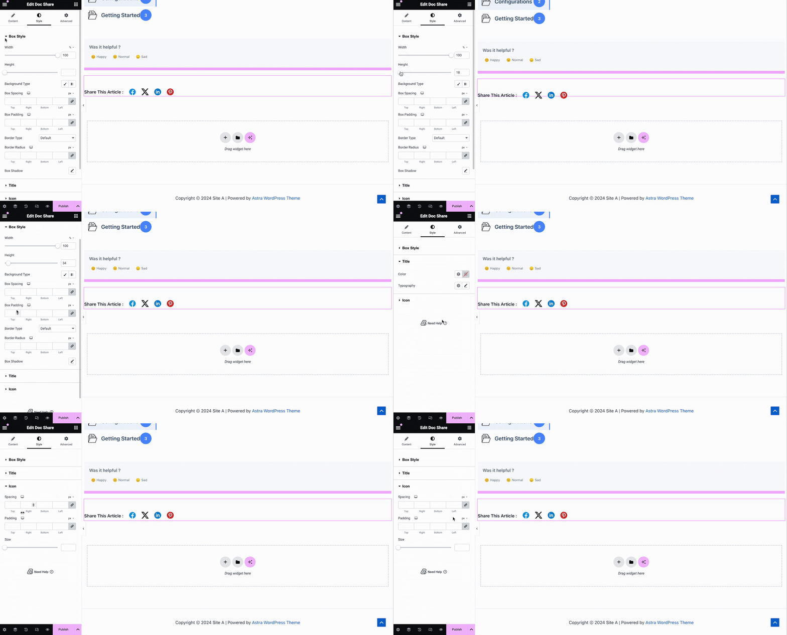
Under the ‘Style’ tab you will see several options to customize the Doc Share, Title, and Icon with margin, padding, color, typography, and more for more personalization.
Doc Feedback #
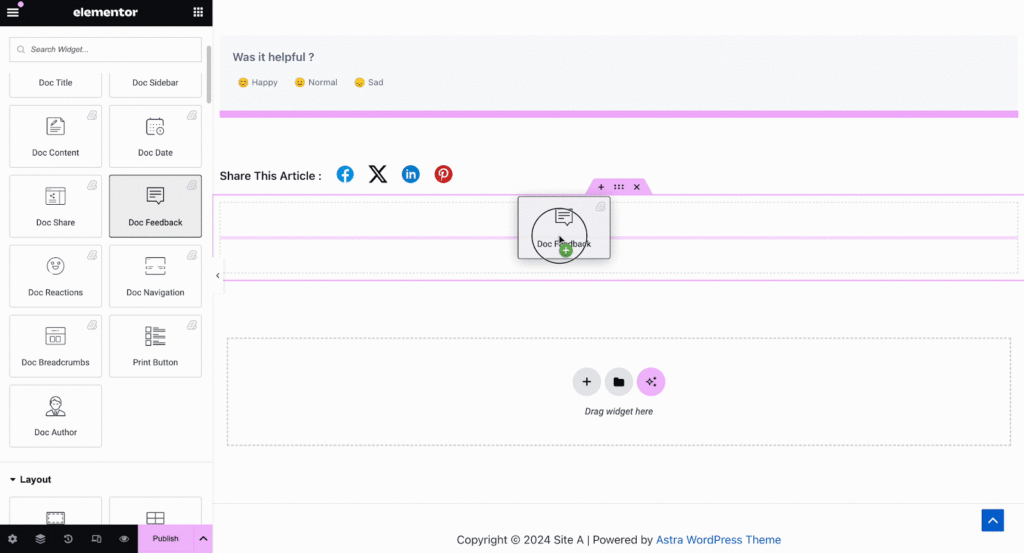
Doc Feedback element lets you add a feedback form for your site visitors which they can use if they want to contact you for further assistance. To activate this element, drag and drop it anywhere on your Single Doc page.
Next, configure the content of your Doc Feedback element from under the ‘Content’ tab. Here, from the ‘General’ section, you can add your custom content feedback, button text, and icon image for the form.
Under the ‘Style’ tab you will see several options to customize the Text, Icon, and Feedback Form with margin, padding, color, typography, and more for more personalization.
Doc Navigation #
With the Doc Navigation element, you can let site visitors move quickly to the next documentation or go back to the previous documentation. To activate this element, drag and drop it anywhere on your Single Doc in Elementor. On the Content tab, you will have two different layouts to choose from.
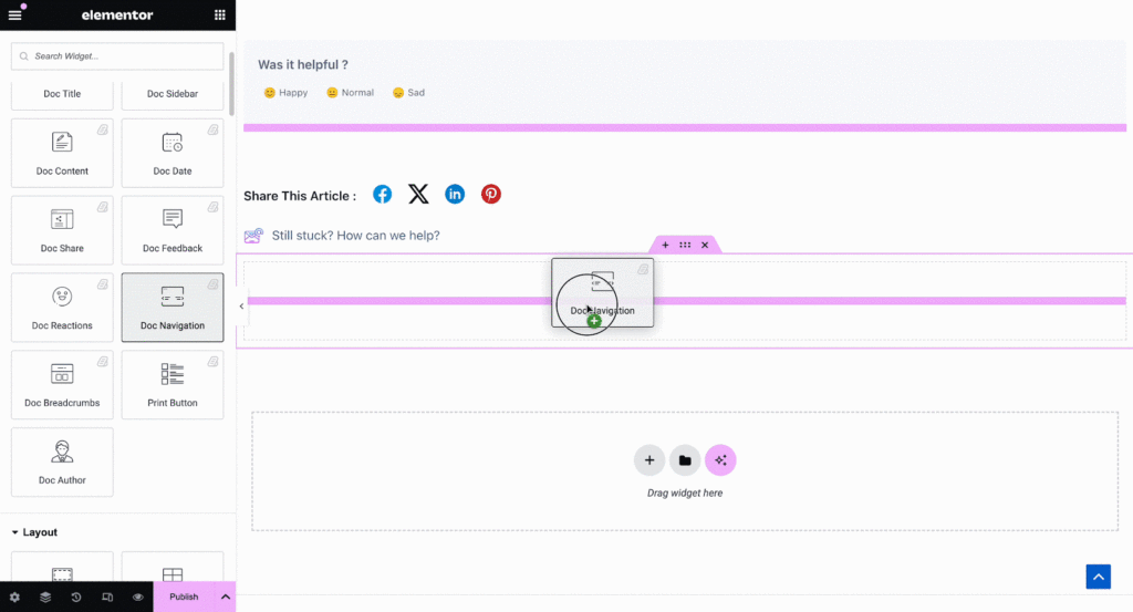
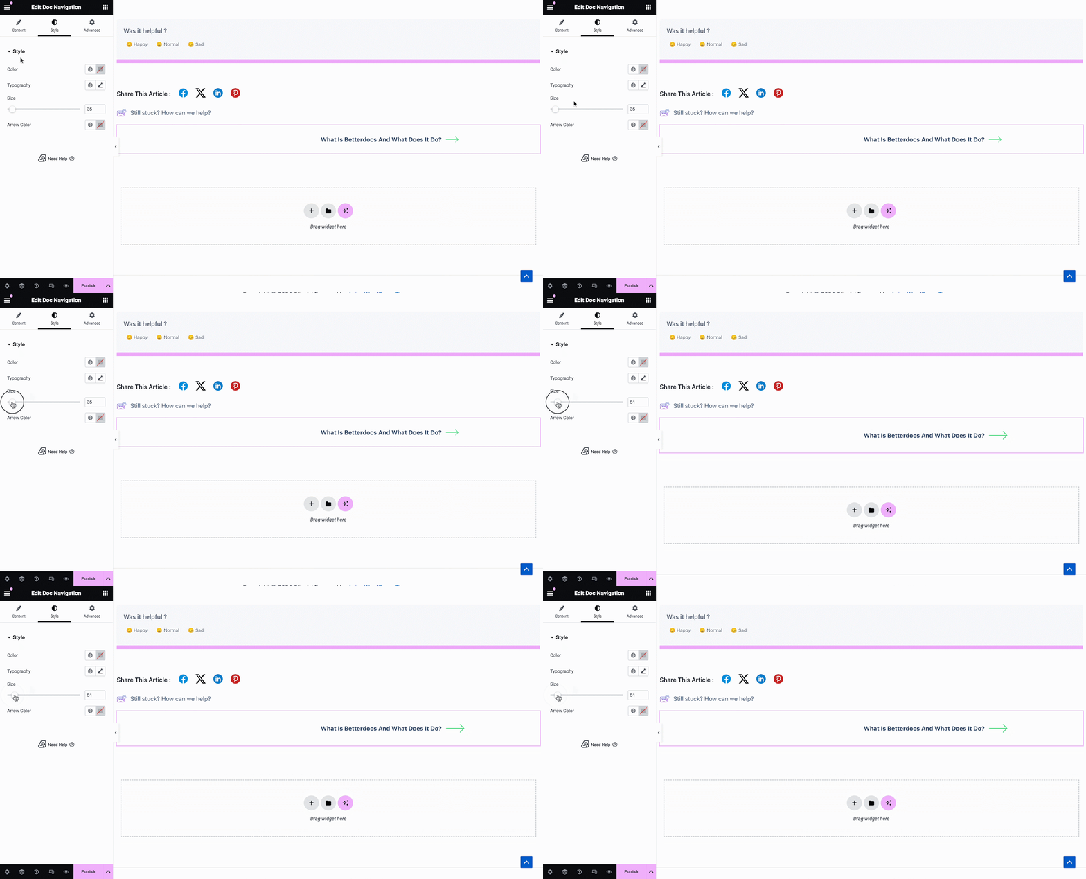
From the ‘Style’ section you can customize the appearance of your Doc Navigation element by changing the color, typography, as well as the size and color of the arrows.
Doc Breadcrumbs #
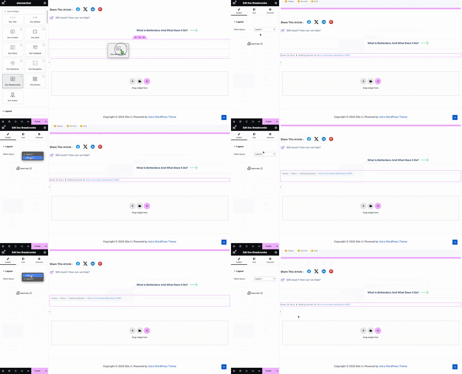
The Doc Breadcrumbs widget will let your visitors keep track of their current location while exploring docs. Simply drag and drop this widget and you will find two layouts on the General tab.
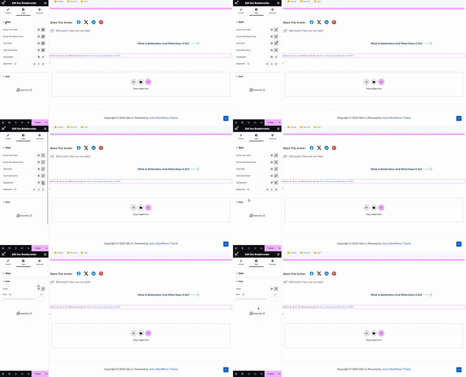
On the Style tab, you can customize the margin, padding, typography, and colors for Style and Icon.
Print Button #
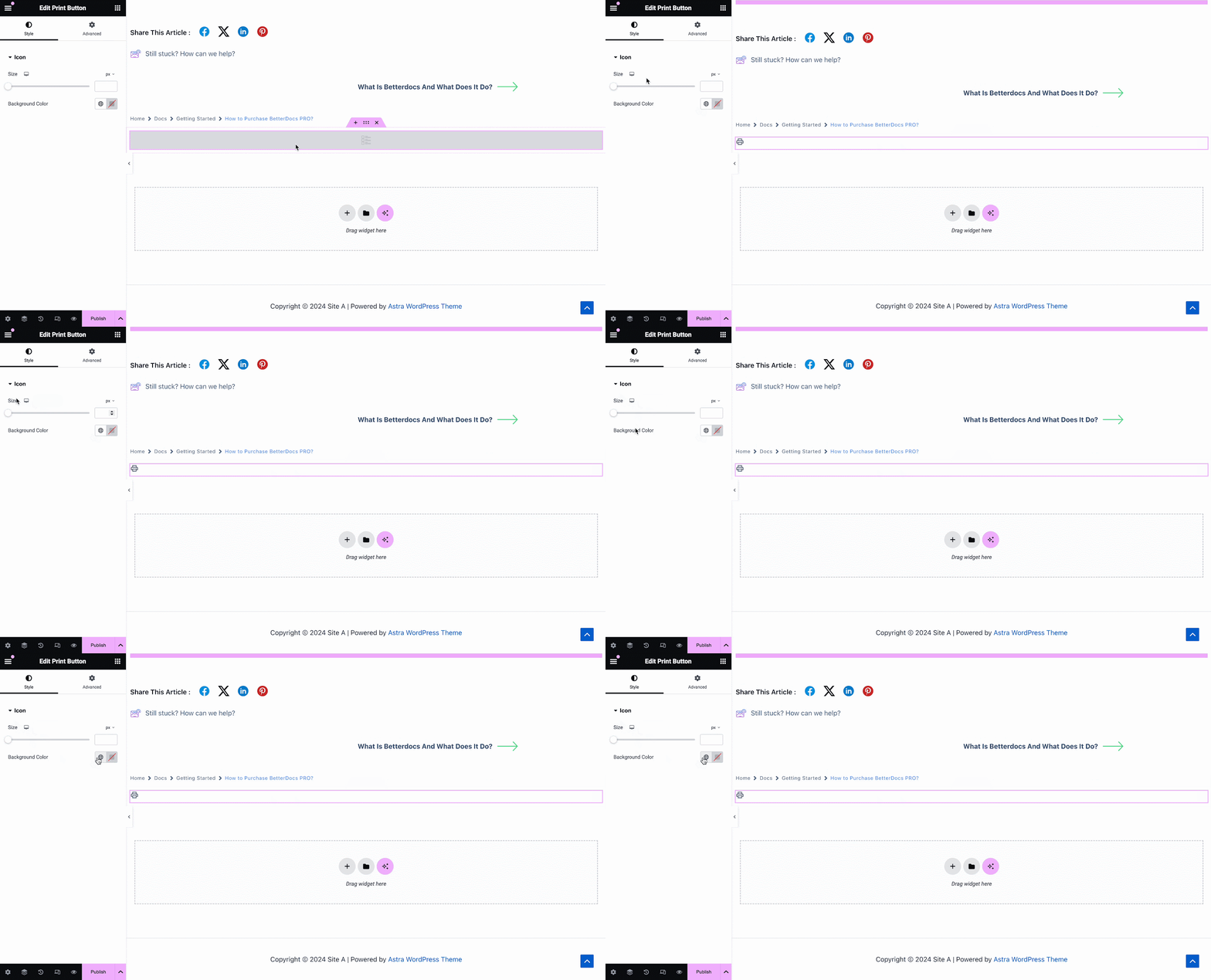
The Print Button widget lets you print your doc with a single click. Once you add the widget, you will have options to change icon size and adjust colors.
Step 3: Set Conditions & Publish Single Doc Page Template #
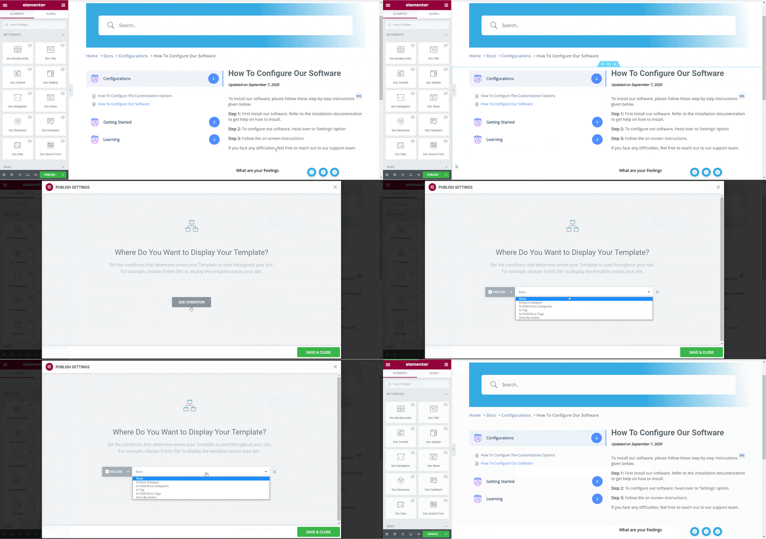
After the above steps have been completed successfully, you can publish your Single Doc page template which you have designed in Elementor. Simply click on the ‘Publish’ button and a popup will appear asking you to set conditions. This step is optional and it lets you decide the conditions under which your Single Doc page will be available to site visitors.
Next, click on ‘Save & Close’. Your Single Doc page template is now saved in Elementor and can be reused again for other single documentation pages.
Final Outcome #
By following these basic steps you can create your own custom Single Doc in Elementor and even reuse them again instantly.
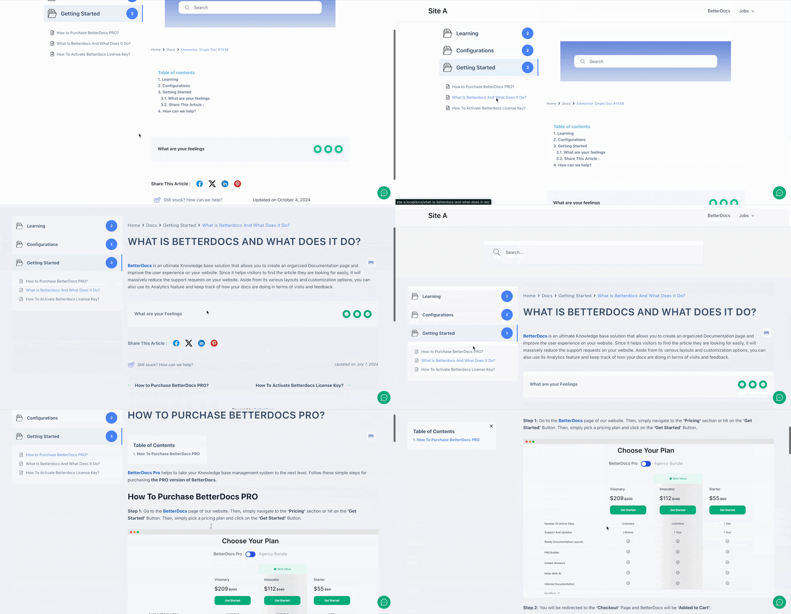
With the help of BetterDocs, this is how you can create stunning single doc templates with Elementor and awe your site readers.
Getting Stuck? Feel free to contact our support team.


